
Leukaemia Care
An Identity Overhaul for an Important Cause
Leukaemia Care’s purpose is to stand beside anyone affected by leukaemia, offering advice, support and hope when it matters most.
Established over 50 years ago, LC was initially formed by bereaved parents and has since evolved into a national charity, providing both emotional and practical support to anyone affected by leukaemia.

The Challenge
Leukaemia Care are a team of incredibly passionate individuals. It was important that as many stakeholders as possible had their say. Our initial questioning revealed that the brand no longer reflected the passion and energy of its people. Stakeholders rated it on average 5/10, citing:
- Outdated, inconsistent visuals and unclear messaging.
- Confusion with research-based charities, meaning LC’s direct support role was overlooked.
- Limited reach, especially to underrepresented groups and people without a direct personal connection to leukaemia.
- A tone that felt more corporate than compassionate.
The charity needed a rebrand that would unite its team, clarify its purpose and resonate with everyone, not just those directly affected.
“We have an incredibly passionate, energetic team at Leukeamia Care. We wanted to ensure that our brand matched this energy; we wanted to give our people something that they would be proud to represent and excited to share.”
Nicole Scully
The Strategy
There were lots of voices that needed to be taken into account, passionate stakeholders who knew LC inside and out.
Throughout the process, it was made clear that understanding the various donor personas was key – both the visual and verbal identity needed to reflect their key personas, both internally and externally.
We conducted a comprehensive discovery process, consisting of questionnaires and meetings, ensuring that everyone who wanted to have a say got the opportunity to.
From this, a single guiding idea emerged:
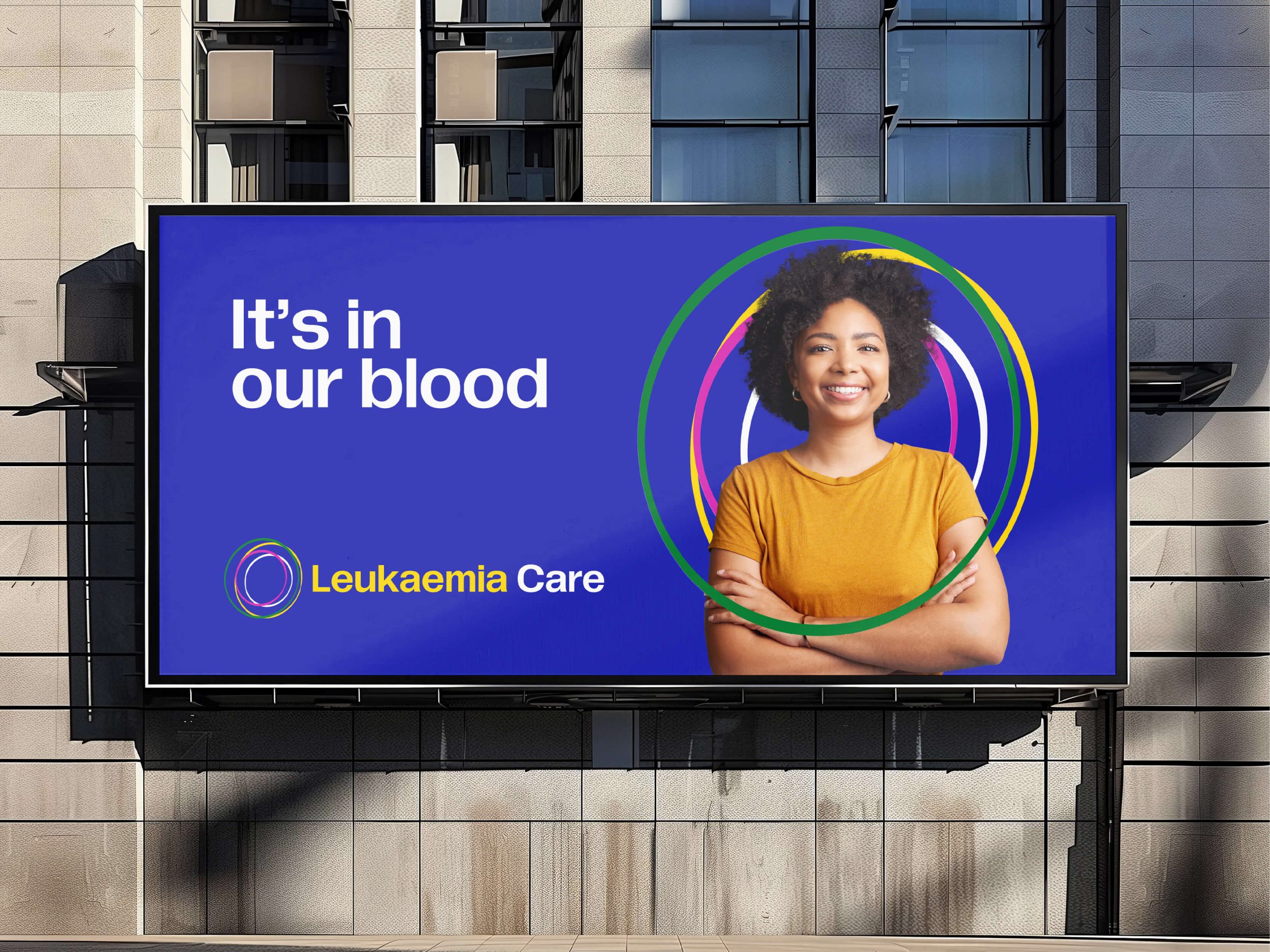
“It’s in our blood.”
A play on words, yes, but a meaningful one; one that resonates with everyone involved, that touches on how deeply the LC team care about their mission.
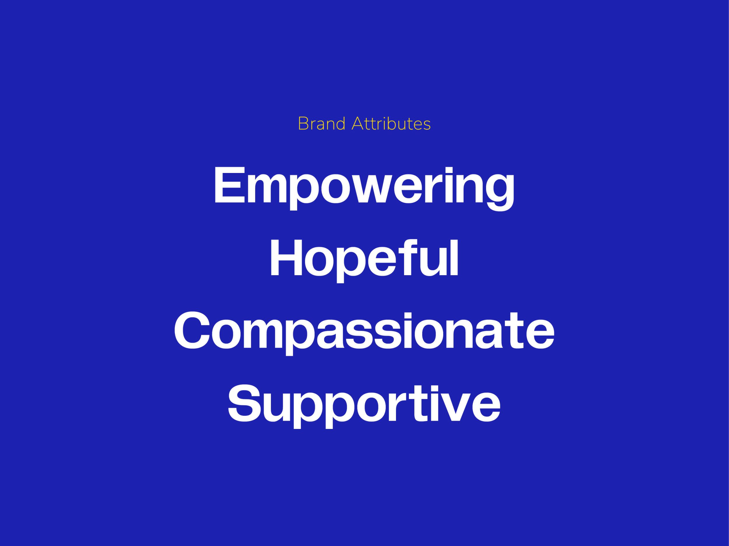
This helped us identify four key brand attributes, the pillars that make Leukaemia Care so special:

Visual Identity
Crafting LC’s visual identity was a collaborative, iterative process.
At the core of everything was LC’s culture of support and community. This is where we started, keeping our guiding idea of “It’s in our blood” in mind at all times.
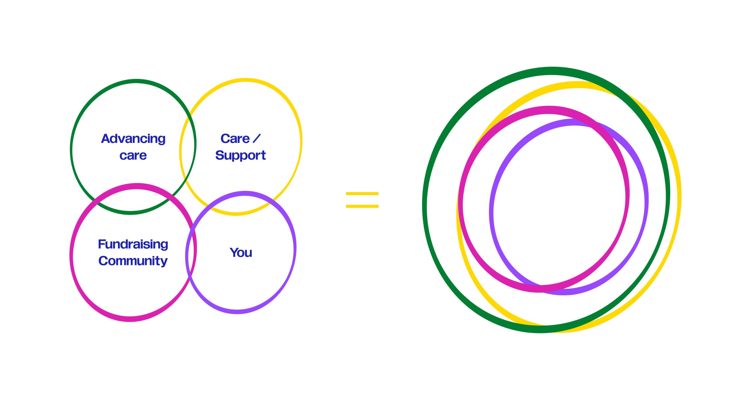
Leukaemia Care’s new device was designed to be free-flowing, crafted specifically to represent the multifaceted nature of their organisation.
As leukaemia is a cancer of the blood, initial concepts were inspired by the shape of a blood cell, representing the creation of new cells and reflecting Leukaemia Care’s postiive message.
In addition, the font was carefully selected for the droplet shape of the counter (negative space). These two concepts formed our initial visual identity, which then evolved over time into what you see today.
At the core of everything, you. It’s the patients, it’s the families, it’s the donors, it’s the community.
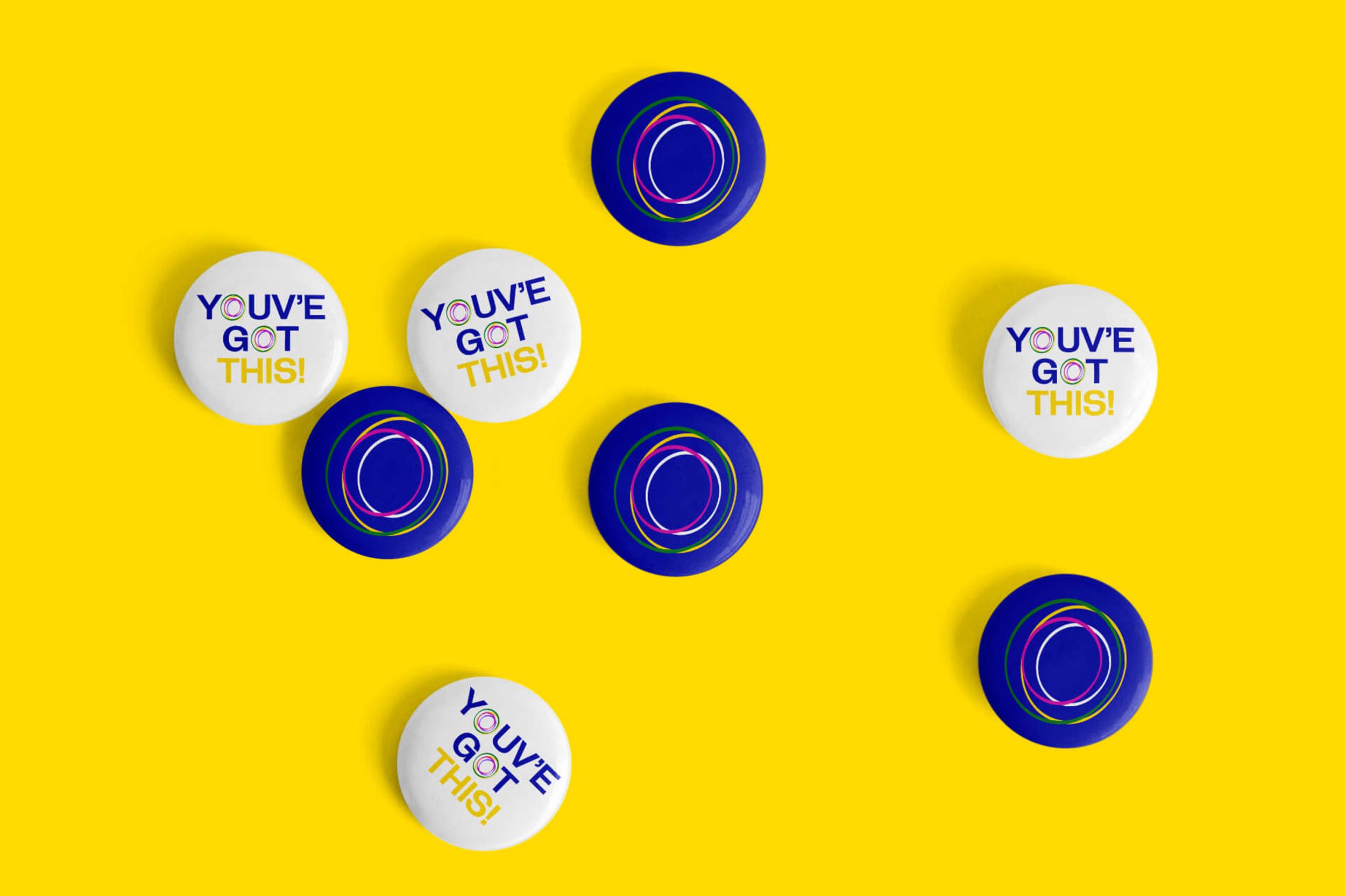
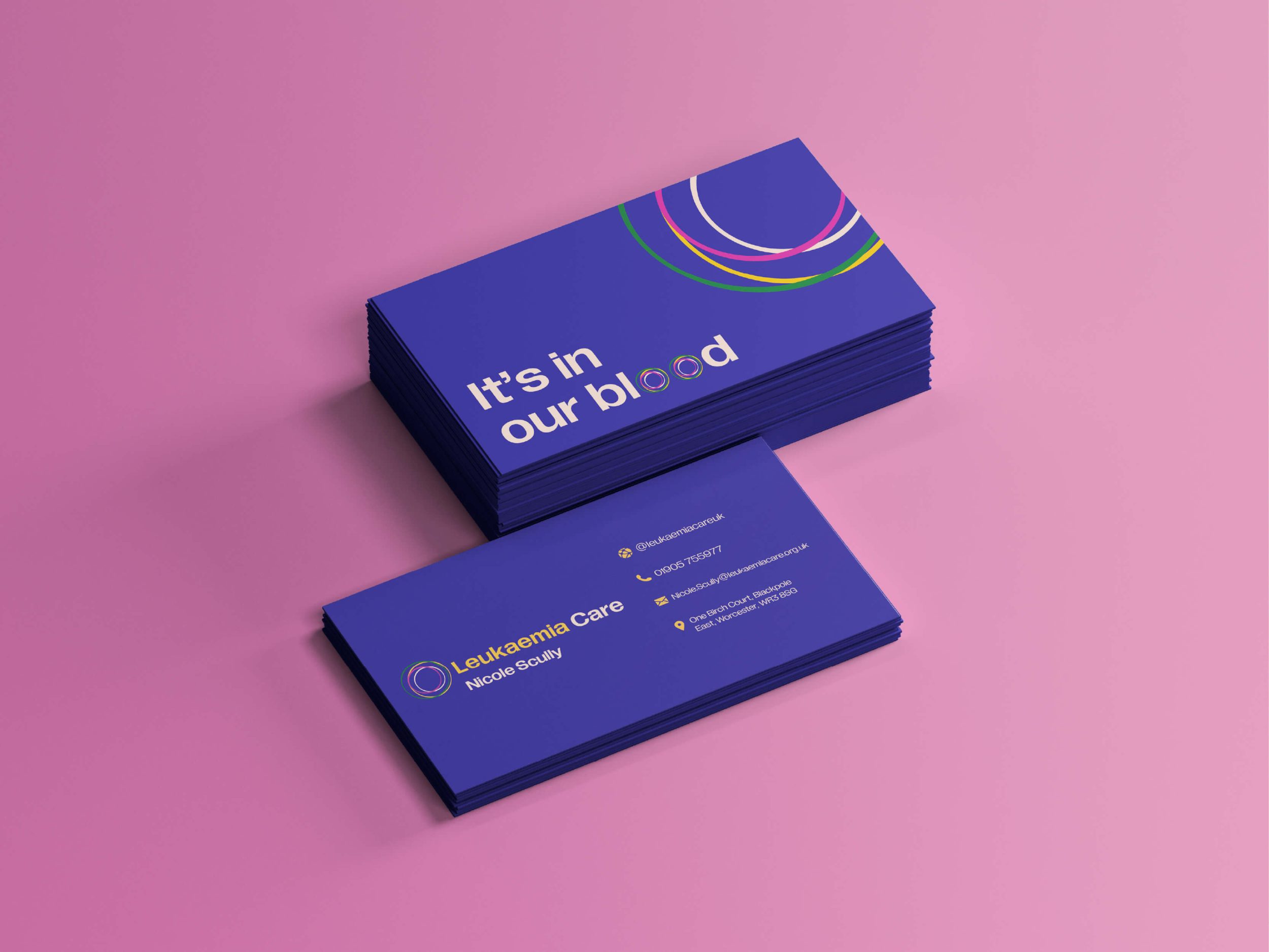
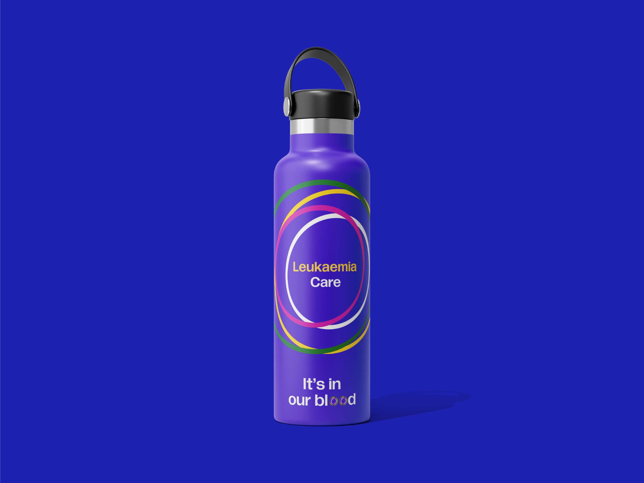
The device was designed to be flexible in its meaning, with colours dancing through their unique palette as required. When combined with LC’s logotype, it all comes together.
Equal parts professional, playful and unique, LC’s new logo is designed to help them stand out in a crowded sector, especially important when it comes to fundraising.

Visual language
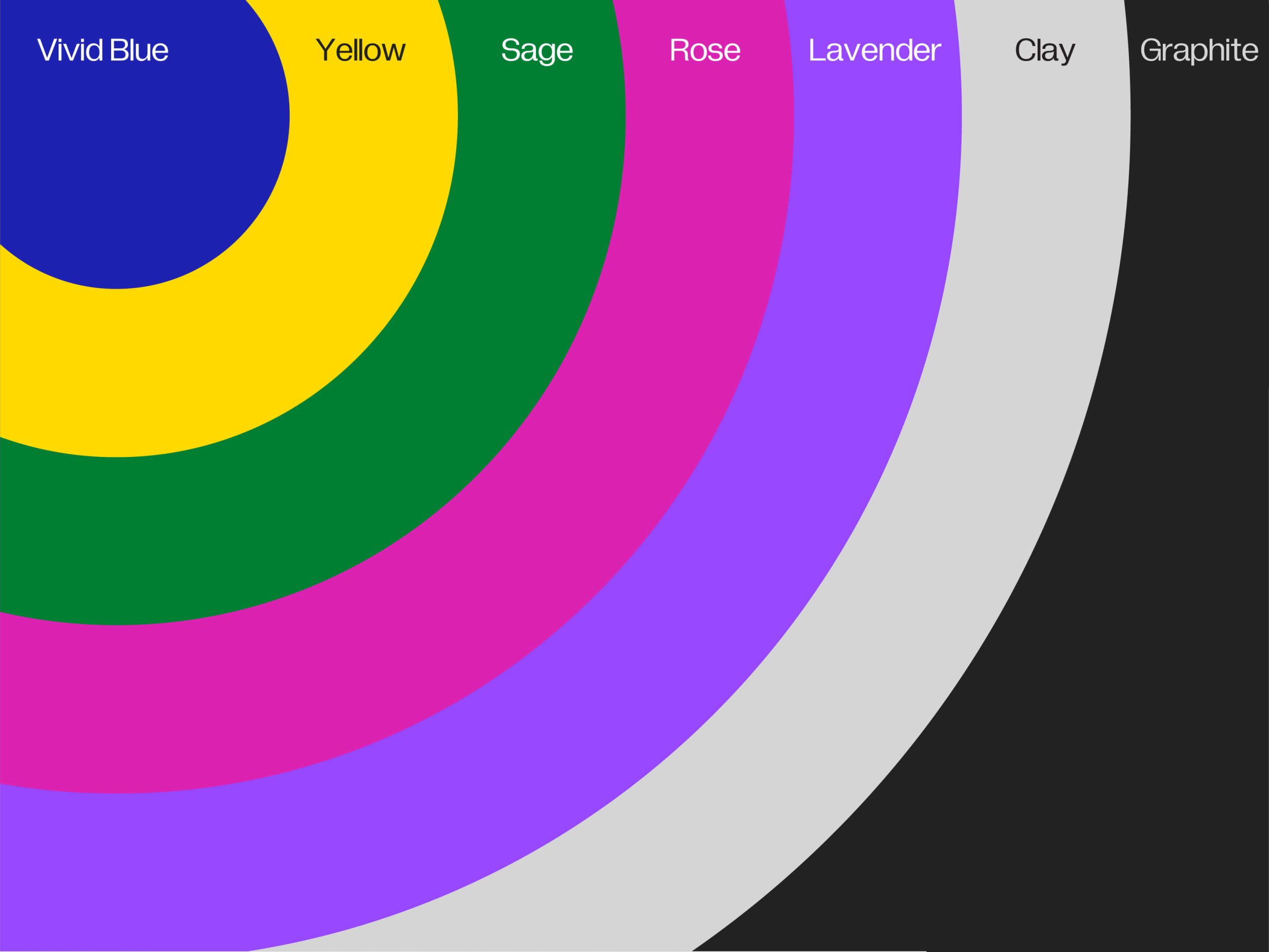
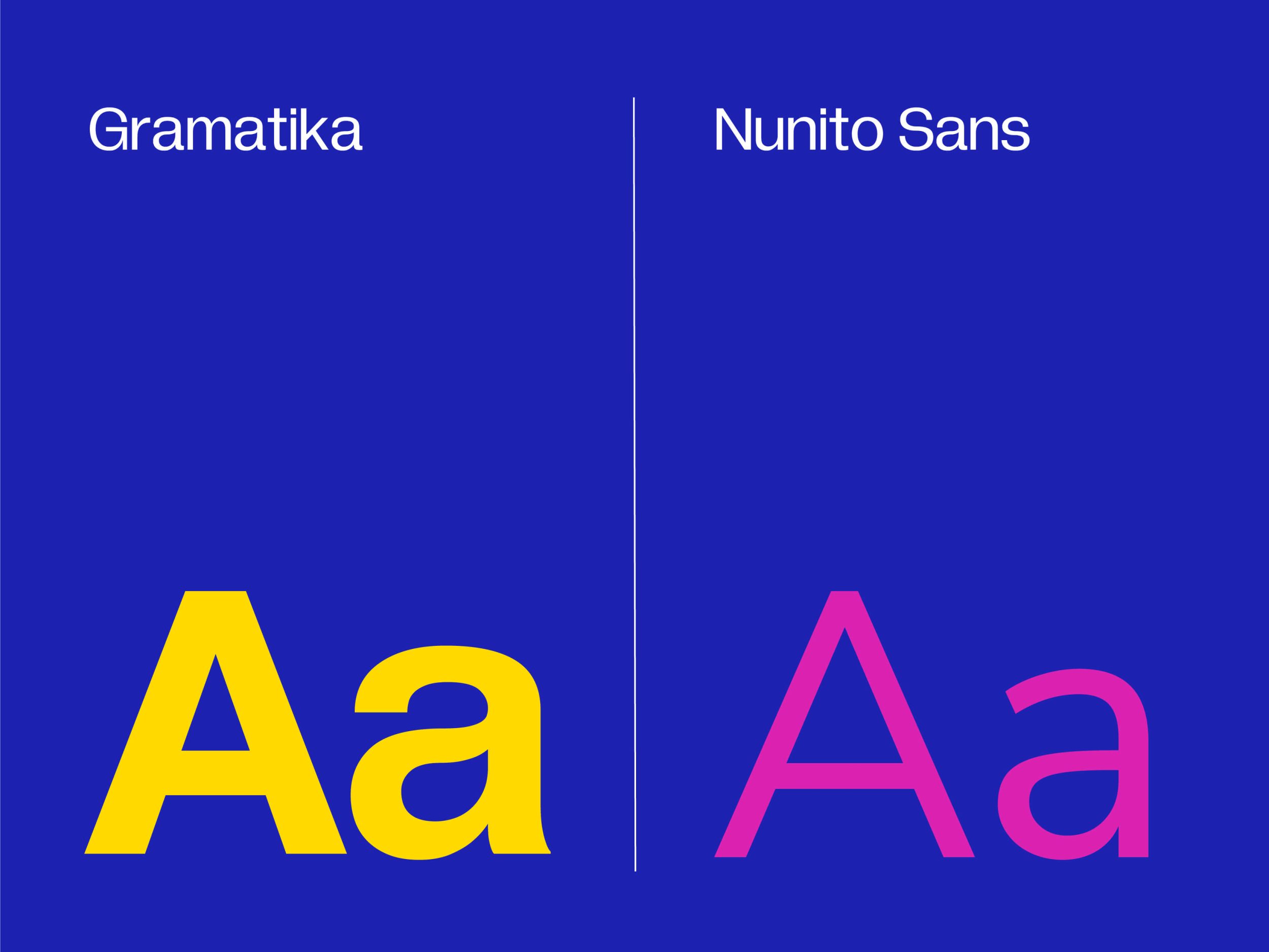
Leukaemia Care needed to retain credibility with the businesses that sponsor them, all while appealing to everyday donors and the general public.
They also wanted a palette that helped them stand out in a crowded sector, a sector that relies on (often outdated) branding that was established decades ago.

Verbal Identity
Compassionate, inclusive messaging sits at the heart of Leukaemia Care.
To ensure consistency across the organisation, our messaging expert worked closely with Leukaemia Care stakeholders, learning what messages worked, what should be avoided, and how they want to position themselves moving forward.
We then workshopped a messaging toolkit, covering:
- An overarching proposition
- A donor-specific proposition
- A corporate-specific proposition
- “Our Purpose” (mission)
- Revised values
Our goal here was to create a verbal identity that resonated across the organisation, from employees and volunteers to donors and community members.
Care. Compassion. Support.
Key pillars of Leukaemia Care’s messaging framework. They avoid jargon, speak in plain English and ensure accessibility for all cultural and educational backgrounds.

Photography
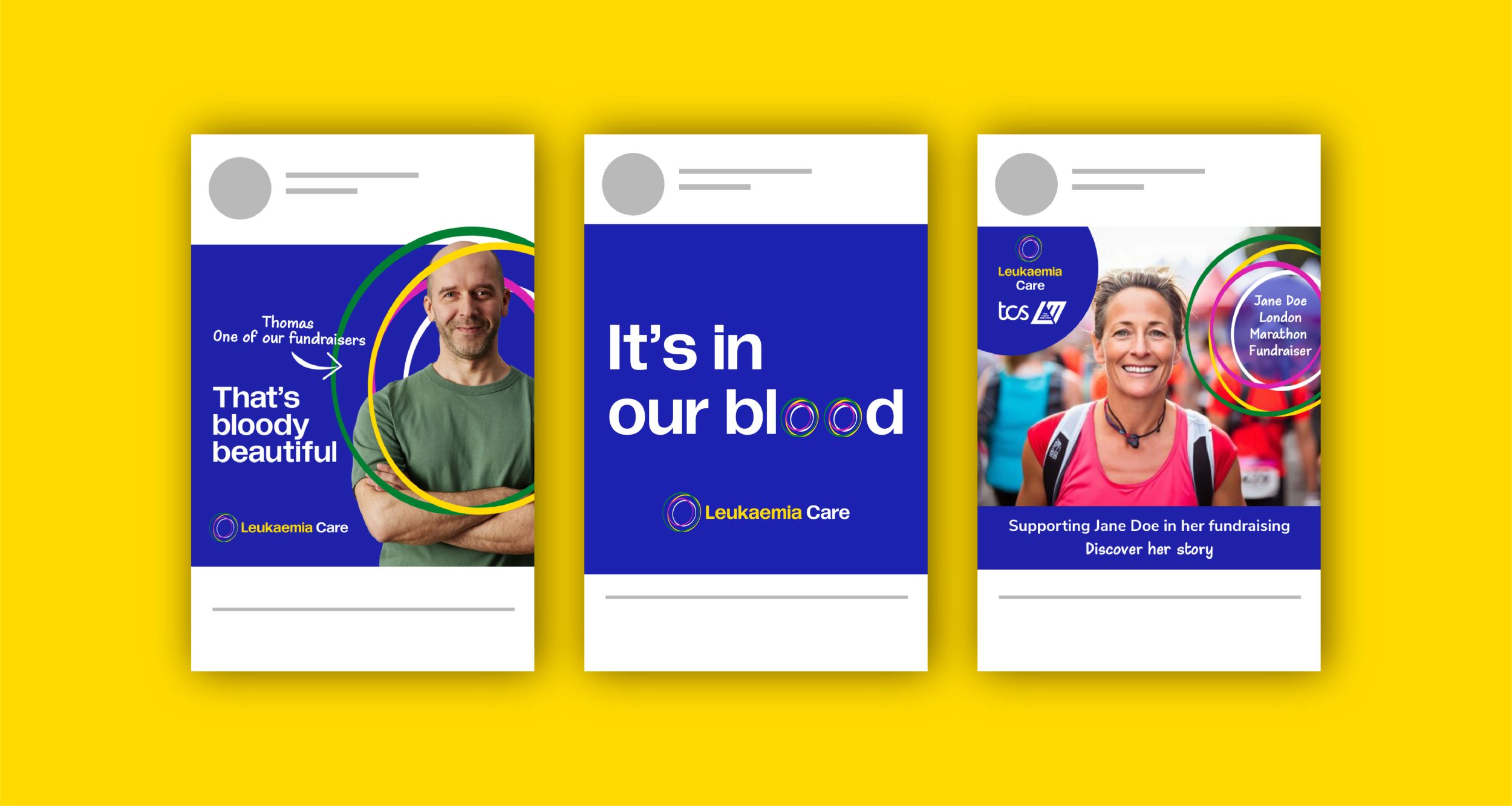
Photography was incredibly important to Leukaemia Care’s brand. We spent a great deal of time working on balancing photography so that it reflected Leukaemia Care’s culture of support and community.
Anything that was chosen needed to reflect real moments with empathy. Candid, well-lit and unposed imagery tells the story of community and connection.