
Procure
Building a Brand with Purpose for Education Procurement
Procure was founded to make school meal procurement simpler, smarter and more transparent.
Their mission is simple but vital: to help schools and multi-academy trusts source healthier, more affordable and sustainable meals without the bloated processes or inflated costs that too often define the industry.
Procure operate exclusively in the education sector, offering everything from full-service procurement and tender management to supplier negotiation and nutritional compliance. Their work ensures that young people receive the food they deserve while schools save time, money and stress.
As a new business entering a crowded market dominated by dated corporate voices, Procure needed a brand that would stand apart; one that would immediately communicate expertise, trust and purpose.

The Challenge
When Procure first approached Catalyst, they were an ambitious new entrant in a traditional sector. Competitors often looked interchangeable: visually bland, overly corporate and missing the emotional connection that schools and communities respond to.
The education catering and procurement space is competitive, with many long-standing organisations dominating the market.
However, this means that complacency has become common. Few discernible differences between competitors posed a unique opportunity for Procure. Their founders knew their value lay in deep sector knowledge and real-world understanding of the challenges schools face, not just compliance or savings, but the impact of quality food on young lives.
Our challenge was clear:
The end goal wasn’t just a logo; it was to position Procure as the go-to education specialists who care. A team that uses their depth of experience and understanding to drive meaningful change and create a positive impact on the young lives shaped by procurement choices.
“Catalyst took the time to really understand what we wanted to achieve, not just visually but commercially. The brand they created feels authentic to who we are and perfectly communicates our purpose. We’ve had nothing but positive feedback from schools and suppliers alike.”
Sebastian Godwin, Co-Founder, Procure Education
The Strategy
Our process began with research and competitor analysis. We explored the broader landscape of education procurement, uncovering how most competitors were fairly corporate and generic in their messaging.
Procure’s team had something genuinely unique: authenticity and sector focus. They weren’t trying to be everything to everyone; their entire model was built around education. That clarity gave us the foundation to build from.
Through workshops and discovery sessions, we defined Procure’s brand proposition and verbal core – language that felt human, confident and purposeful.
From this, a central idea emerged:
Procure are the education procurement specialists.
Their job isn’t just to save schools money; it’s to give children access to better food, every day.
That became the heartbeat of the brand.
We built a clear, consistent messaging framework that reflected real pain points their clients face: rising costs, inconsistent quality and a lack of transparency from suppliers. Our tone of voice had to reassure and inspire, practical but never cold.
Once we had these foundations set, it was time to move on to Procure’s new look and feel.


Visual Identity
With the verbal identity in place, we moved on to crafting Procure’s visual world, one that would instantly stand out from the competition.
We wanted to capture the brand’s focus on quality and trust, but also bring warmth and personality to what can be a dry, transactional industry.
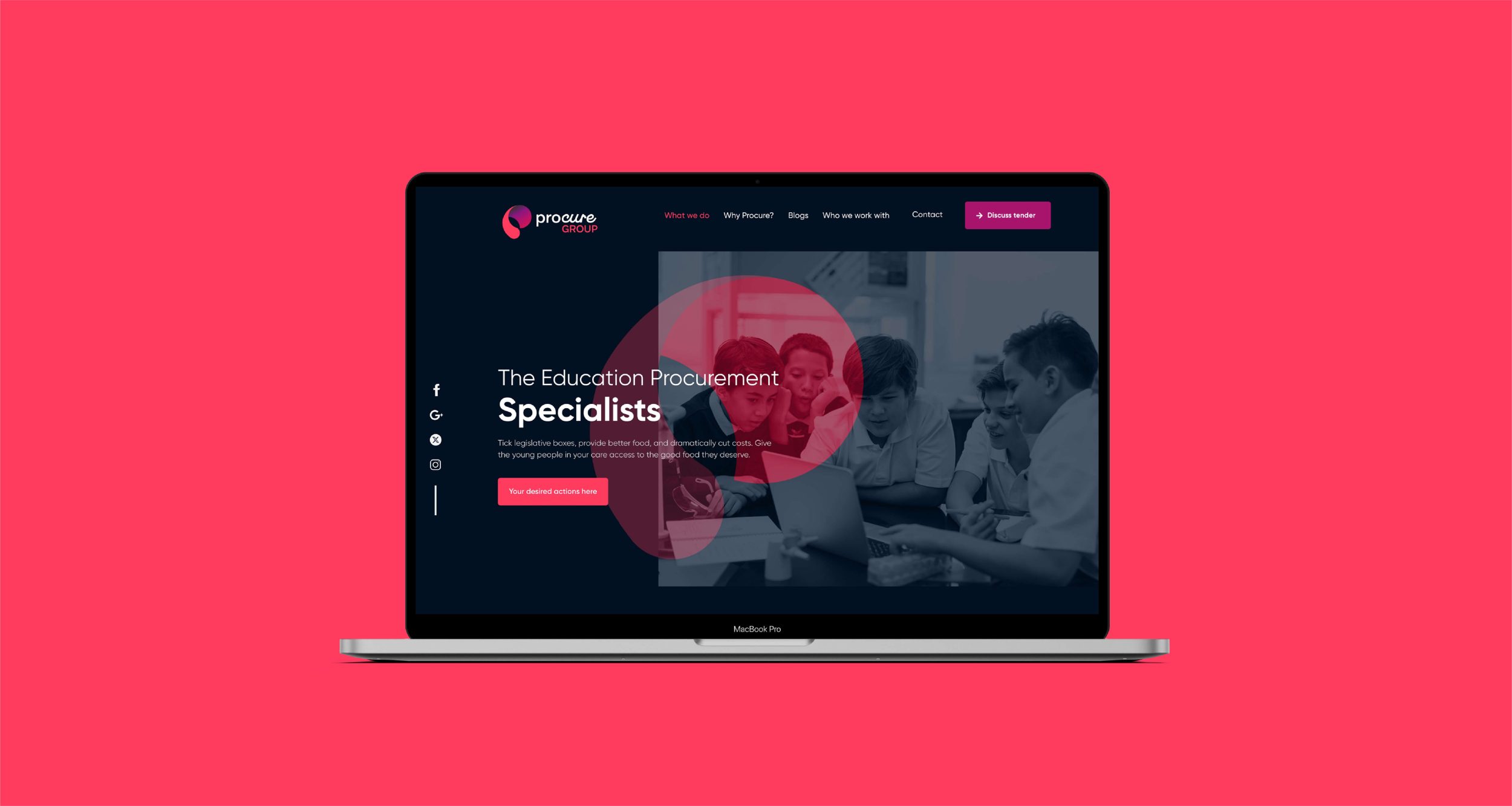
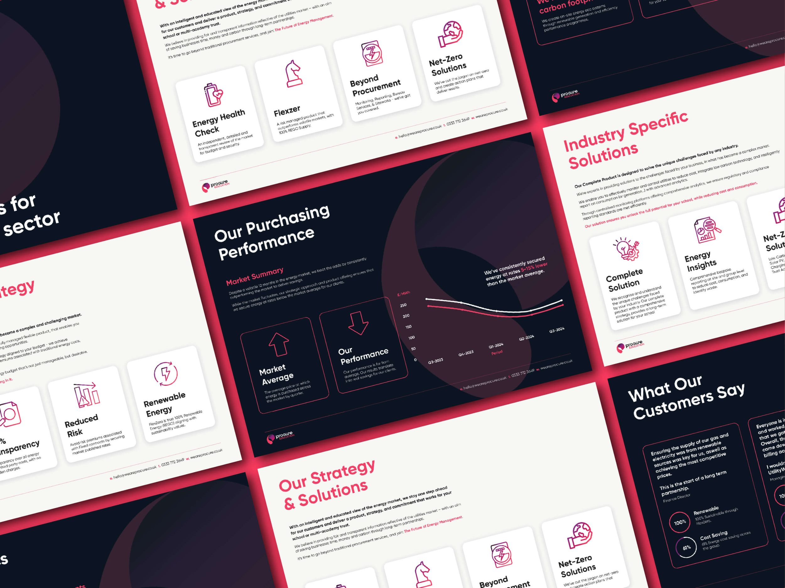
The resulting visual identity is clean, modern and distinctive.

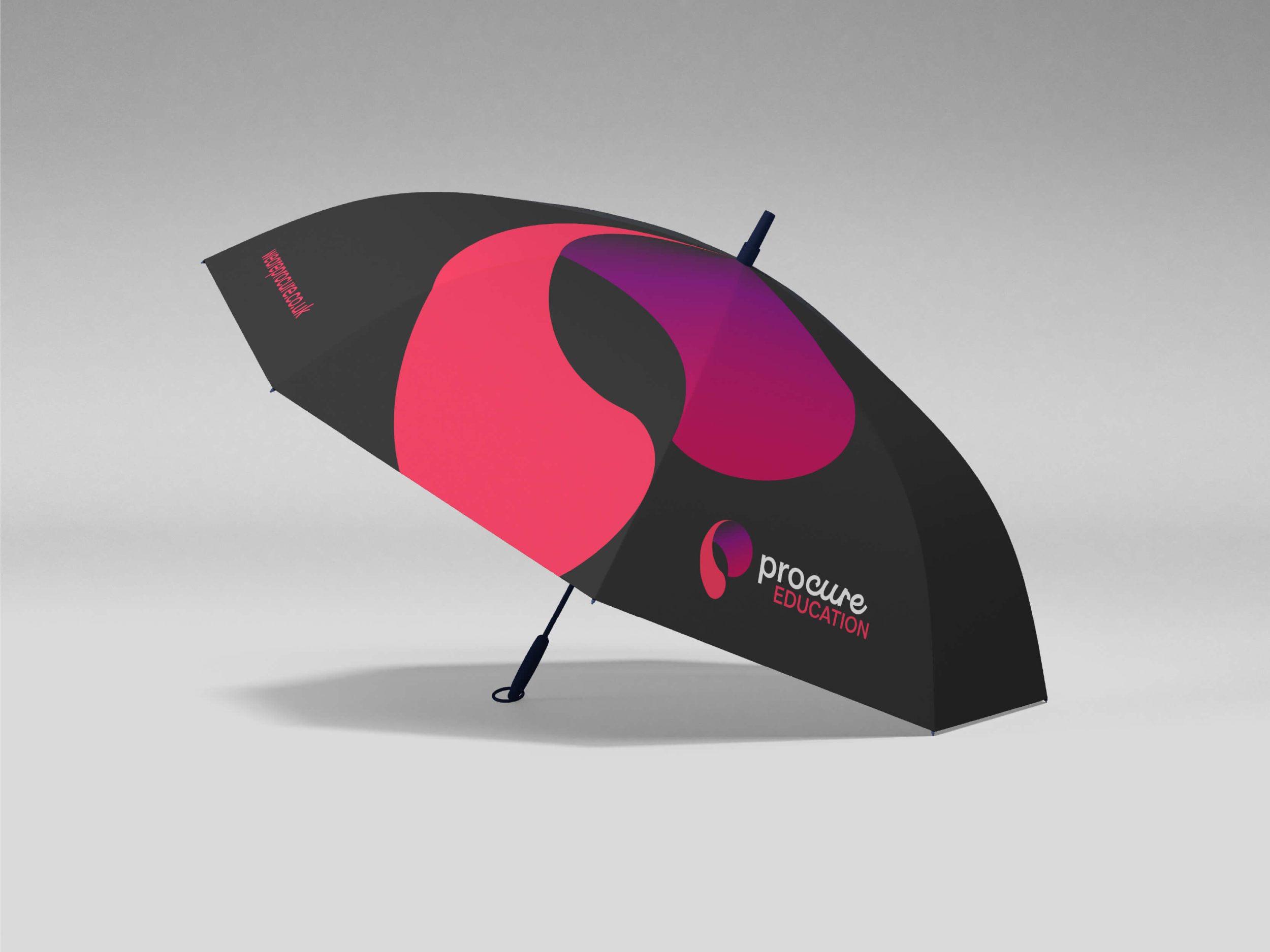
Visual language
The colour palette, bright yet professional, reflects both reliability and optimism. It symbolises freshness, transparency and the positive impact good procurement can make on children’s wellbeing.
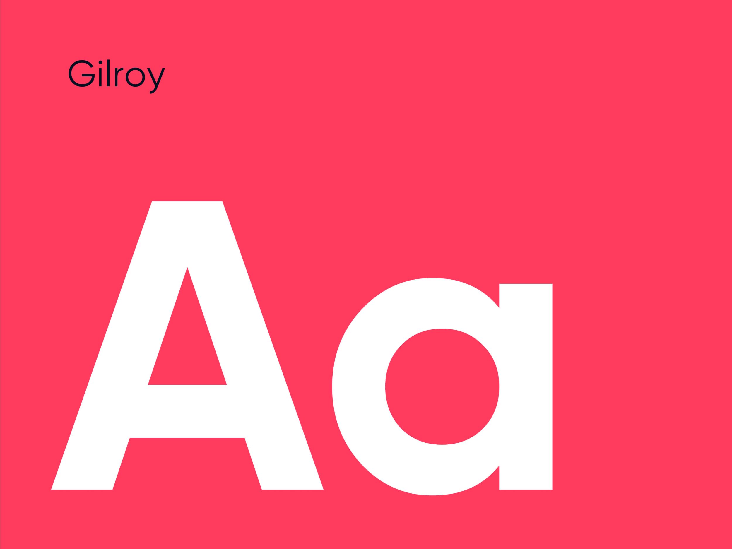
Typography choices were made to balance authority and accessibility, giving Procure a voice that feels confident but friendly. The geometric shapes and linear structures in the logo design subtly nod to order, structure and the idea of connecting suppliers and schools in a seamless, efficient way.
The overall look and feel is deliberately different from the “corporate blue” and “government grey” tones common in the sector. Procure’s new brand exudes clarity and energy, instantly recognisable and built for credibility.



Verbal Identity
We developed a full verbal identity to match Procure’s fresh new look.
Procure’s tone of voice is expert yet approachable, professional without being bureaucratic. The messaging focuses on outcomes, not process; on what schools and children gain, not what’s simply delivered.
Every message was crafted to communicate three key ideas:
- Trust – They know the sector inside out and deliver measurable value
- Clarity – They make procurement simple, transparent and stress-free
- Impact – They help schools feed young people better for less
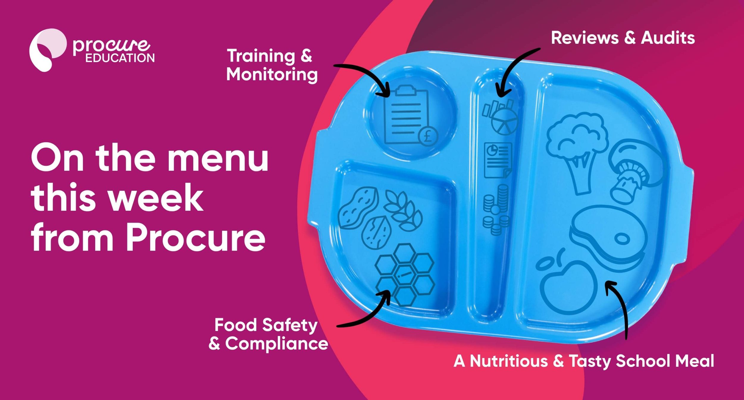
We built a messaging toolkit to ensure consistency across every touchpoint, including website copy, sales collateral and social media. This framework ensures the same confident tone carries through every conversation and every document, building recognition and credibility from the ground up.
The Impact
Procure’s new brand gave them a platform to launch with authority.
They now look and sound like what they truly are: specialists with purpose, driven by the belief that schools deserve better food and fairer procurement.
Since the rebrand, Procure have been able to confidently approach multi-academy trusts, position themselves as sector experts and begin building long-term partnerships on the strength of their identity and message.