
Greenside Golf
Rebranding to Gain Market Share and Build Customer Trust
Launching a new brand is tough. Launching one in the leisure market, where competition is fierce and first impressions are everything?
Now that’s a challenge.
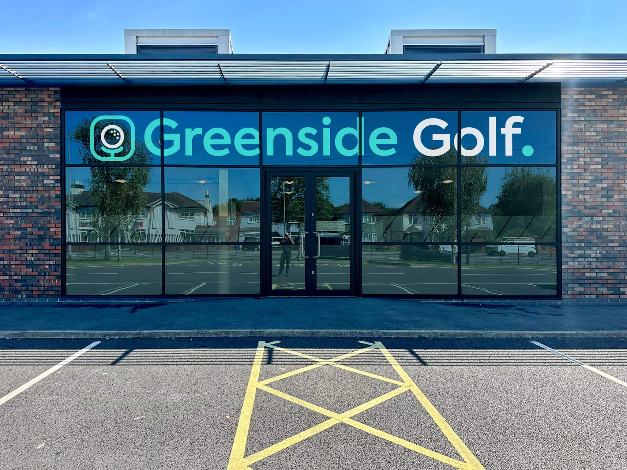
Greenside Golf had the vision: a premium, tech-powered simulator experience designed to attract golfers of all abilities.
They had their location. They had the tech. They had the team.
They were missing the brand – something that lived up to their ambition, wowed customers and potential investors alike. Greenside needed a clear visual and verbal identity, which is why they sat down with our brand team.
The Strategy
We don’t start with colours or logos, we start with clarity. So, we introduced the Greenside team to our experts, holding a brand discovery workshop and asking the big questions: Who are you really for? What do you want people to feel when they walk through the door? Why should they pick you over every other golf experience out there?
We paired those conversations with deep competitor research and audience insights, mapping out the crowded golf and leisure space and spotting the gaps Greenside could own.
The opportunity was clear: position Greenside Golf as modern, premium and welcoming, with a brand that makes golf feel exciting, not exclusive. Then watch the customers roll in.
Easy, right? Step one was to help the team find their voice.

Visual Identity
While words set the tone, visuals seal the deal. Our design team explored different creative directions, from high-energy and dynamic to sleek and understated, before landing on a look that perfectly balanced sporting edge with premium polish.
Through iterations and design reviews, we refined the identity:
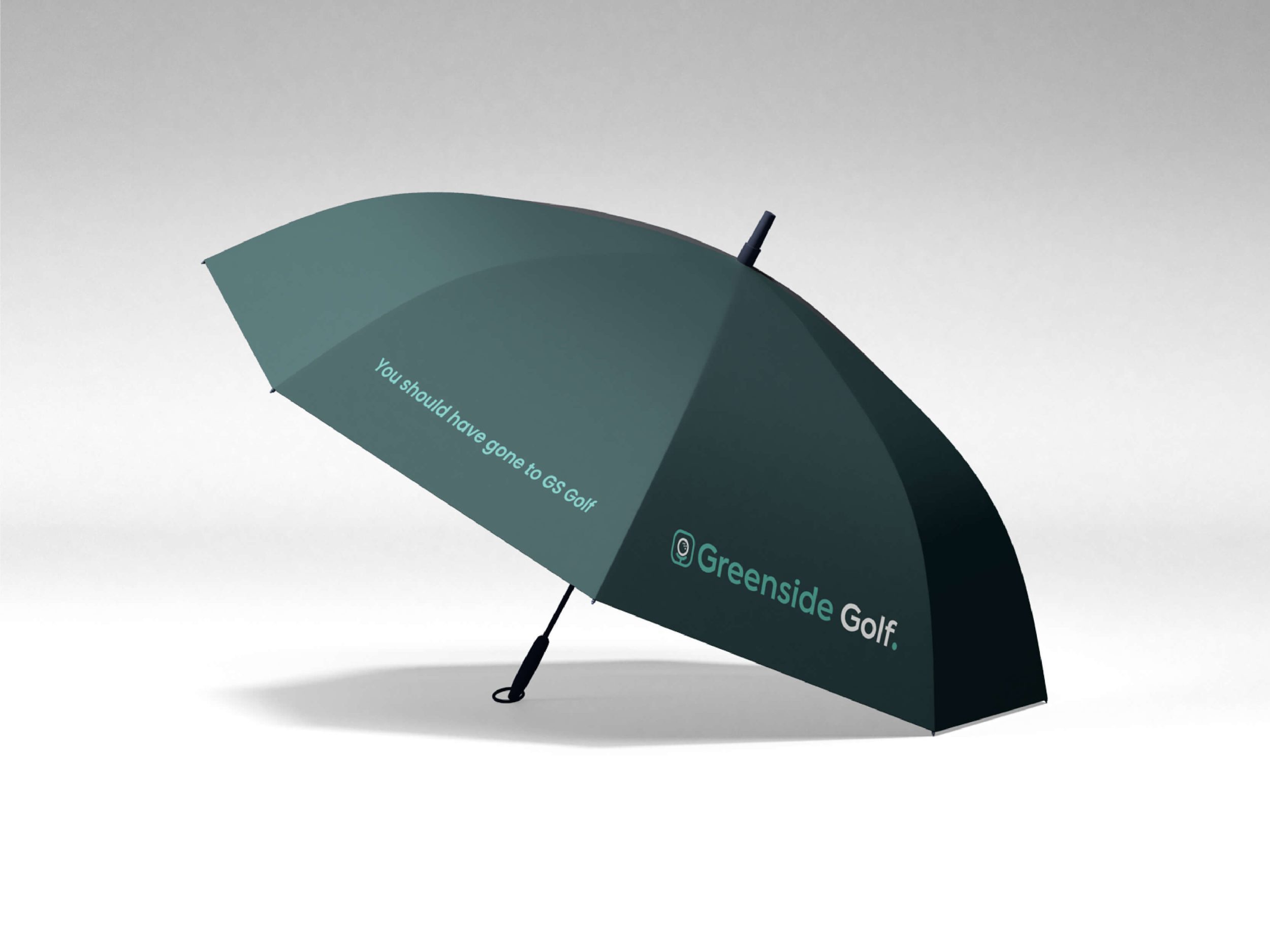
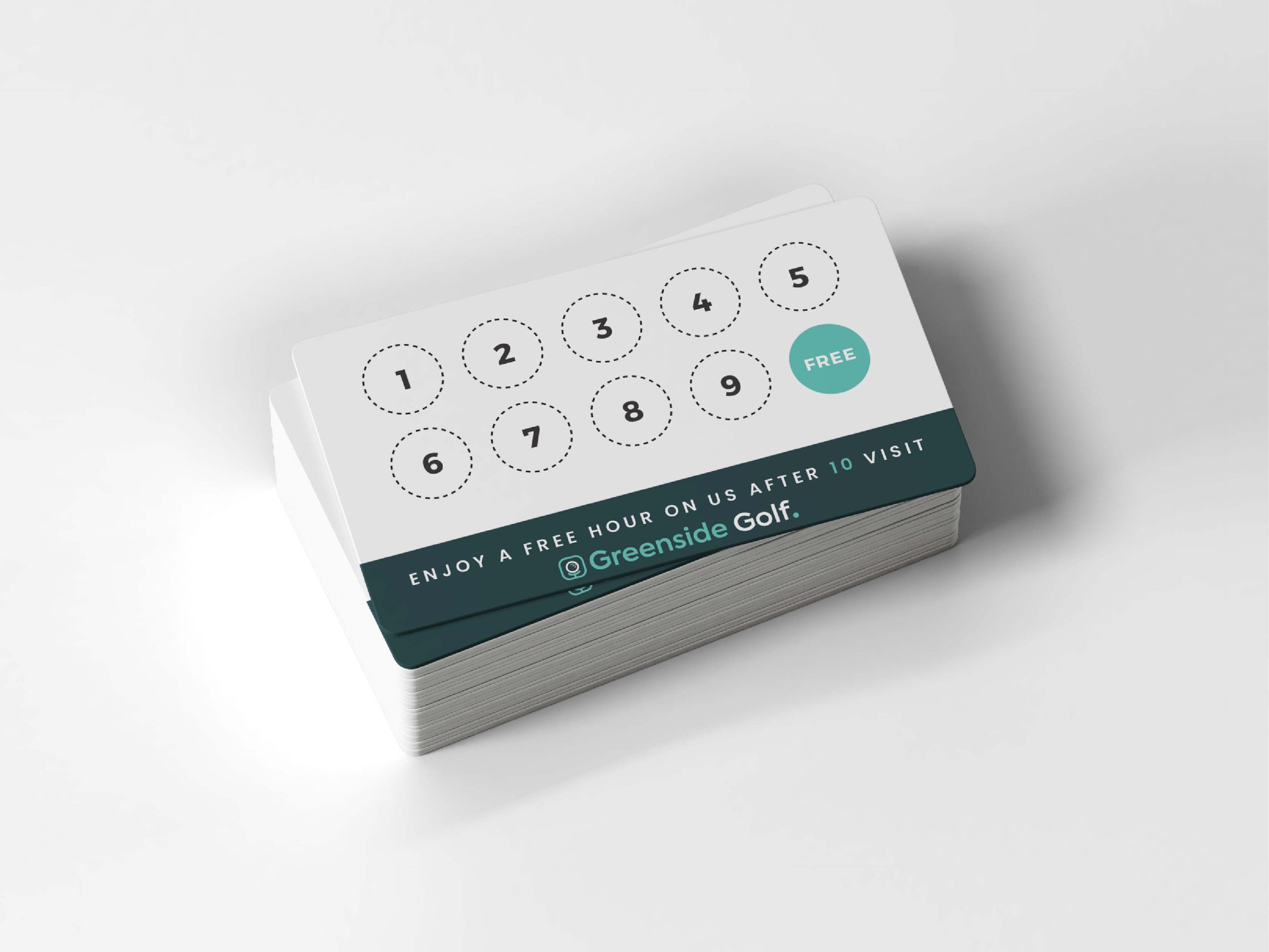
- A clean, versatile logo that works just as well on a screen as it does embroidered on a polo shirt.
- Unique logo animations that can be used across socials or in future video content.
- A bold but sophisticated colour palette that signals confidence and style.
- A modern typographic system that keeps everything crisp, consistent and instantly recognisable.
Together, it became a visual system that captured their unique modern take on an old game, helping to get people excited before they’ve even swung a club.
Once the overarching brand was set in stone, we mapped out the two branching paths:
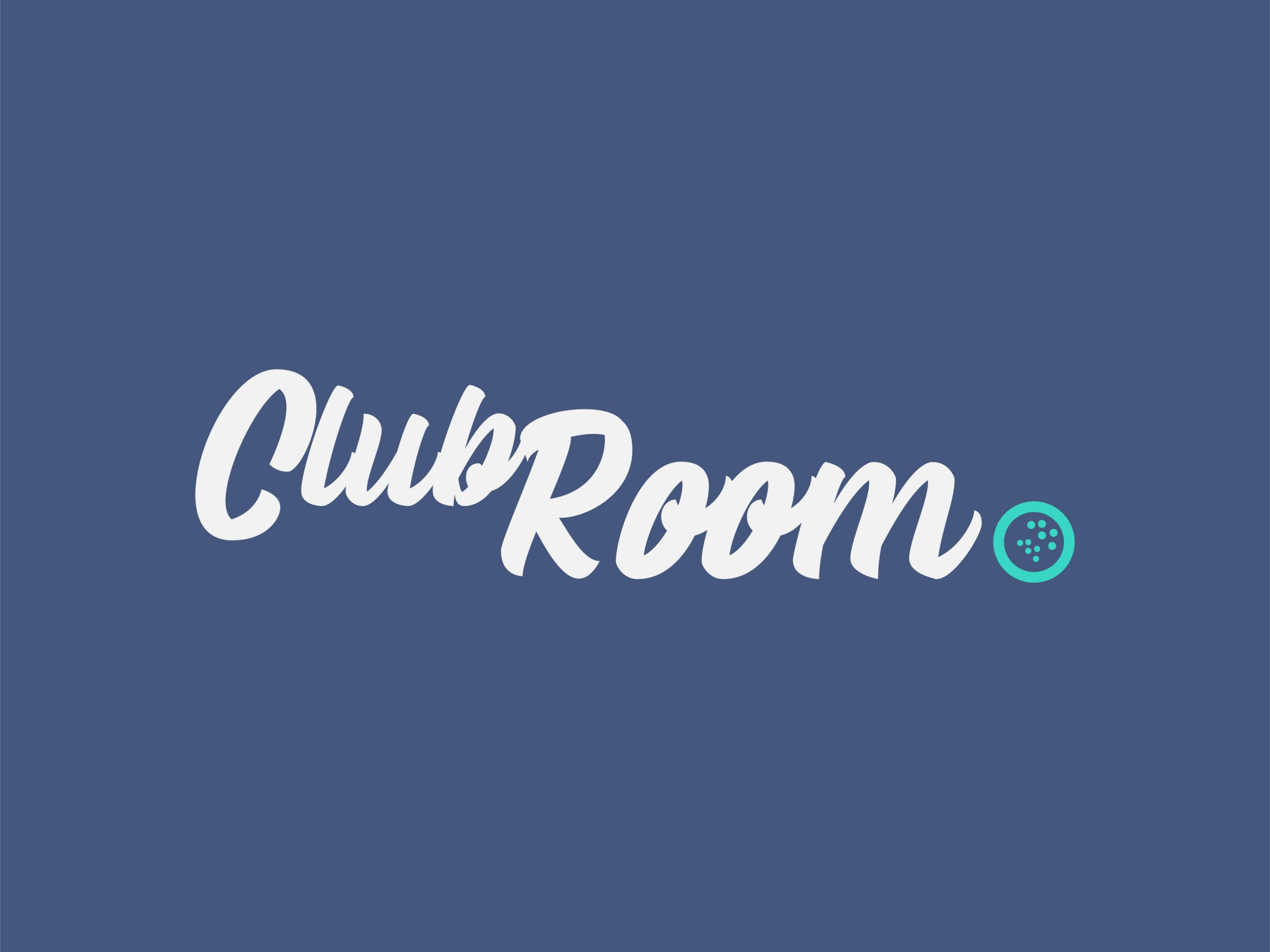
Club Room – Designed to be casual, sleek and appealing to non-golfers as it is to golfers.
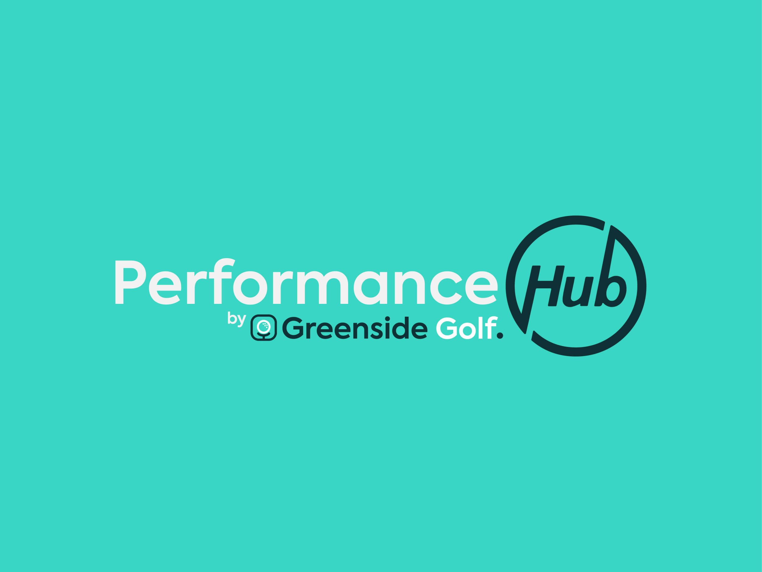
Performance Hub – The place for serious golfers to improve their game.

Visual language
Leukaemia Care needed to retain credibility with the businesses that sponsor them, all while appealing to everyday donors and the general public.
They also wanted a palette that helped them stand out in a crowded sector, a sector that relies on (often outdated) branding that was established decades ago.




Verbal Identity
Following our research, one thing was clear: Greenside needed clear-cut, punchy positioning that struck the perfect balance between:
- New, young golfers who aren’t interested in the dusty heritage of a very old game.
- Established golfers who might feel alienated by changing tech and new ways to play their favourite game.
Two very different target audiences, one challenge. Through interviews, questionnaires and a lot of sticky note brainstorming, we tested language, refined messages and shaped a tone of voice that felt right.
We settled on a tone that was bold, but inclusive – a friend that knows their stuff, but doesn’t take the game too seriously (unless you really want to). We built a messaging framework around Greenside’s core principle:
“Reimagining how golf is played.”
This messaging framework gave the team ready-to-use words for their website, socials, launch campaigns and beyond. Everything from sharp straplines to longer narrative copy was designed to make people sit up, take notice and say this is different.
We also looked at creating two core pillars of the business, one for casual golfers and one for serious players looking to improve their game alongside a professional. This gave rise to Club Room and the Performance Hub. Two parts of the whole that provide golfers with a choice of what they want:
- Fun, arcade-like golf simulations to enjoy with your mates over a beer.
- Realistic, training-focused games to improve your play on the course.
To ensure these were properly differentiated, we needed to ensure their visual identity was on point


The Outcome
Greenside’s launch was a resounding success. Their marketing team made great use of their new killer brand, producing content for their socials that has helped them grow their presence significantly, leading to booked bays and many, many shanked shots.
Now, Greenside Golf stand out in a competitive market. They weren’t some start-up with a good idea; they were a serious contender with a serious business (and a serious brand to back them up!).
For Greenside Golf, this wasn’t just about logos and taglines. It was about building a brand with the power to drive their business forward, and that’s exactly what we delivered.